In Excel, I was able to create bar charts, line charts, heatmaps, and scatterplots, which also provided me with a Pivot Table, detailing me about the charts being formed. The impact of these visualizations on my understanding of the data would depend on the research question, based on which I would be able to create visualizations with the maximum details.
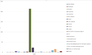
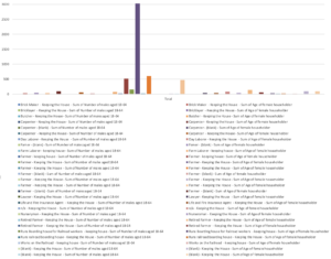
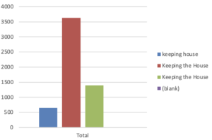
While working with various Pivot Charts in Excel to gain insights from the dataset, I encountered an interesting issue related to the occupation data for both women and men in the Grinnell Township census of 1870. Upon filtering women by their occupation, I noticed that they were grouped into three seemingly redundant categories: “keeping house,” “Keeping the House,” and “Keeping the House” once again. Similarly, when examining the occupation data for men, I observed similar errors for the occupation category ‘farmer.’
This raised a question regarding whether these anomalies were introduced by the dataset itself, perhaps due to inconsistencies in data entry or recording, or whether Excel’s data processing may have contributed to this issue. Resolving these inconsistencies would be important for accurate data analysis and visualization. The same graph for men also had similar errors for the occupations like ‘farmer’.
Additionally, data cleaning or normalization techniques could be applied to ensure that the occupation data is consistent and accurate for meaningful analysis and visualization along with the handling of missing data.
Screenshots of three graphs highlighting the occupation distribution of men, women, and families –